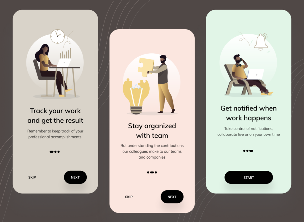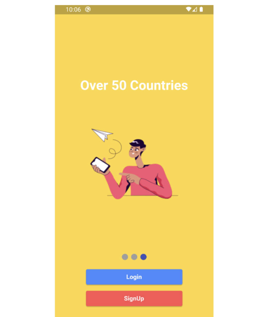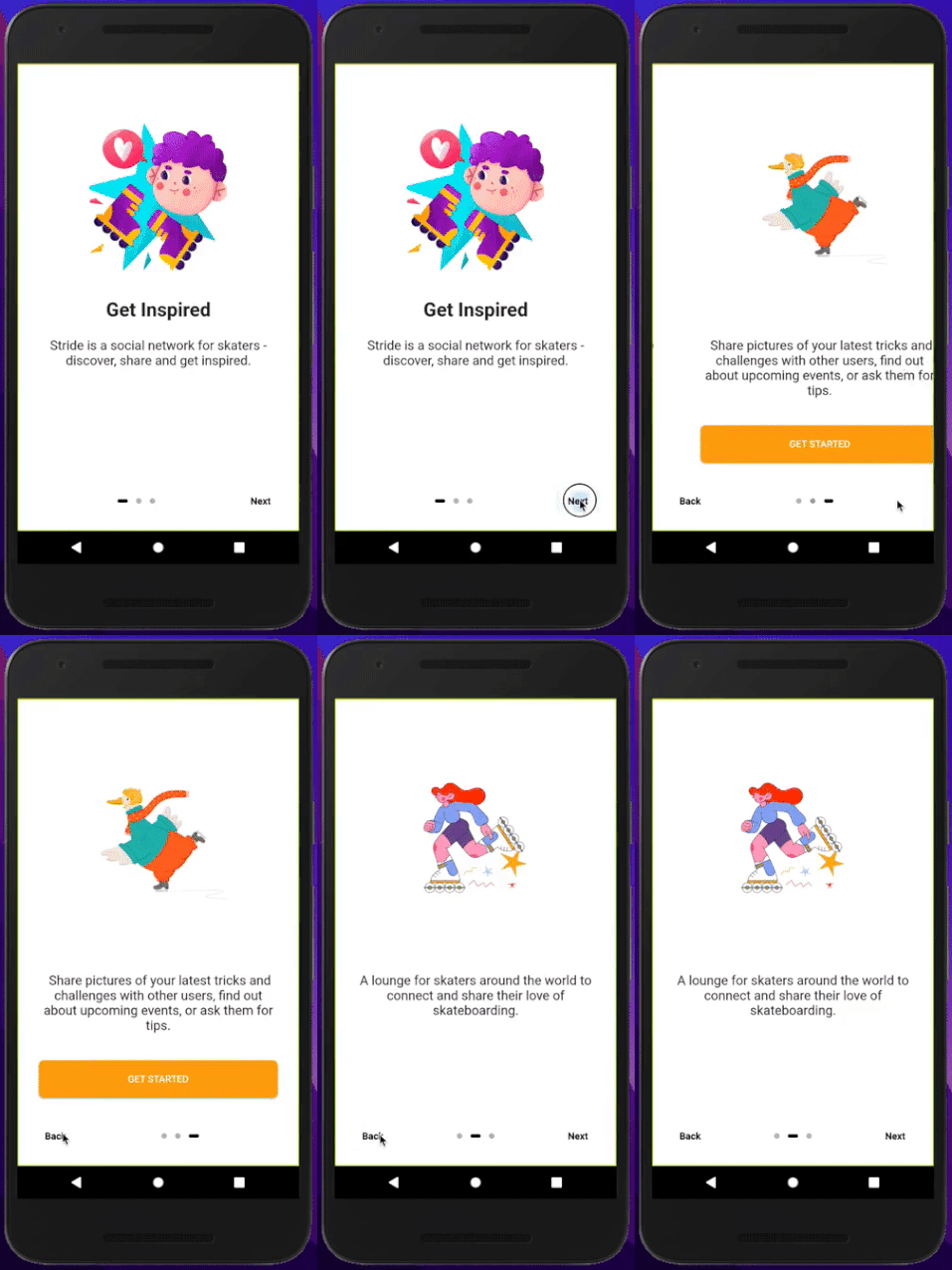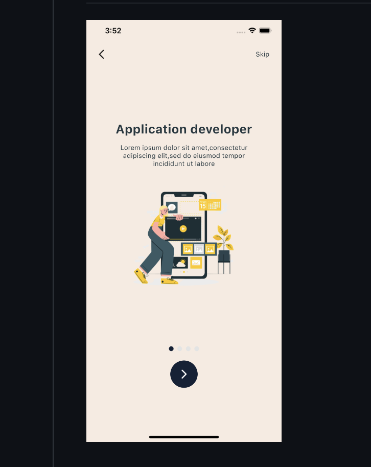
The first thing a user sees when they open your app is not your home screen. It is your onboarding screen. That first impression lasts. A well-designed onboarding experience tells the user what your app does, why it matters to them, and invites them in — all within 3 to 4 screens.
In this tutorial, we are going to build a fully professional, beautifully animated Flutter onboarding screen UI — completely from scratch with no heavy third-party packages (only one lightweight indicator package).
You will get:
- A smooth swipeable multi-page onboarding flow using PageView
- Beautiful animated dot page indicators
- Animated gradient backgrounds that change per page
- Skip and Next buttons with proper navigation logic
- A "Get Started" button on the final page
- SharedPreferences integration so onboarding shows only once (on first launch)
- Clean, reusable widget architecture
- Complete source code you can copy and use directly
By the end of this post, you will have a production-ready onboarding screen that looks premium and feels native on both Android and iOS.
What We Are Building
Our onboarding screen will have 3 pages:
- Page 1 — "Discover Amazing Things" — introduces the app concept
- Page 2 — "Fast & Easy to Use" — highlights speed and simplicity
- Page 3 — "Get Started Today" — call to action

Each page has a large centered illustration area (using Flutter's built-in icons styled beautifully), a title, a subtitle, and animated transitions between pages. The bottom area has dot indicators, a Skip button (top right), a Next button, and on the final page a full-width "Get Started" button.
Project Setup
Create a new Flutter project:
flutter create beautiful_onboarding cd beautiful_onboarding
Open pubspec.yaml and add the following dependency:
yaml
dependencies:
flutter:
sdk: flutter
shared_preferences: ^2.2.3
smooth_page_indicator: ^1.1.0
Run:
flutter pub get
That is all we need. Two lightweight, well-maintained packages.
Project Folder Structure
Organize your project like this for clean, maintainable code:
lib/
├── main.dart
├── models/
│ └── onboarding_model.dart
├── screens/
│ ├── onboarding_screen.dart
│ └── home_screen.dart
└── widgets/
├── onboarding_page.dart
└── dot_indicator.dart
This separation of concerns makes the code easy to read, maintain, and scale.
Step 1 — Create the Onboarding Data Model
Create the file lib/models/onboarding_model.dart:
import 'package:flutter/material.dart';
class OnboardingModel {
final String title;
final String description;
final IconData icon;
final Color primaryColor;
final Color secondaryColor;
final Color iconColor;
const OnboardingModel({
required this.title,
required this.description,
required this.icon,
required this.primaryColor,
required this.secondaryColor,
required this.iconColor,
});
}
// Define all 3 onboarding pages here
final List<OnboardingModel> onboardingPages = [
OnboardingModel(
title: 'Discover Amazing Things',
description:
'Explore a world of possibilities right at your fingertips. Everything you need is just one tap away.',
icon: Icons.explore_rounded,
primaryColor: const Color(0xFF1A1A2E),
secondaryColor: const Color(0xFF16213E),
iconColor: const Color(0xFF4FC3F7),
),
OnboardingModel(
title: 'Fast & Easy to Use',
description:
'Designed for speed and simplicity. Get things done faster than ever with our beautiful, intuitive interface.',
icon: Icons.bolt_rounded,
primaryColor: const Color(0xFF0F3460),
secondaryColor: const Color(0xFF1A1A2E),
iconColor: const Color(0xFFA78BFA),
),
OnboardingModel(
title: 'Get Started Today',
description:
'Join millions of users who love our app. Your journey to something amazing starts right now.',
icon: Icons.rocket_launch_rounded,
primaryColor: const Color(0xFF1B1B2F),
secondaryColor: const Color(0xFF0F3460),
iconColor: const Color(0xFF34D399),
),
];
This model is clean and reusable. Every page's data — title, description, icon, and colors — comes from this list. You can add more pages simply by adding more items to the list.
Step 2 — Build the Individual Onboarding Page Widget
Create lib/widgets/onboarding_page.dart:
import 'package:flutter/material.dart';
import '../models/onboarding_model.dart';
class OnboardingPage extends StatelessWidget {
final OnboardingModel data;
final double animationValue; // 0.0 to 1.0
const OnboardingPage({
super.key,
required this.data,
required this.animationValue,
});
@override
Widget build(BuildContext context) {
final size = MediaQuery.of(context).size;
return Padding(
padding: const EdgeInsets.symmetric(horizontal: 32.0),
child: Column(
mainAxisAlignment: MainAxisAlignment.center,
children: [
// ── Illustration Circle ──
_buildIllustration(size),
const SizedBox(height: 60),
// ── Title ──
AnimatedOpacity(
opacity: animationValue,
duration: const Duration(milliseconds: 400),
child: Text(
data.title,
textAlign: TextAlign.center,
style: TextStyle(
fontSize: 30,
fontWeight: FontWeight.w800,
color: Colors.white,
height: 1.2,
letterSpacing: -0.5,
),
),
),
const SizedBox(height: 20),
// ── Description ──
AnimatedOpacity(
opacity: animationValue,
duration: const Duration(milliseconds: 500),
child: Text(
data.description,
textAlign: TextAlign.center,
style: TextStyle(
fontSize: 16,
color: Colors.white.withOpacity(0.65),
height: 1.7,
fontWeight: FontWeight.w400,
),
),
),
],
),
);
}
Widget _buildIllustration(Size size) {
return TweenAnimationBuilder<double>(
tween: Tween(begin: 0.8, end: 1.0),
duration: const Duration(milliseconds: 600),
curve: Curves.elasticOut,
builder: (context, scale, child) {
return Transform.scale(
scale: scale,
child: child,
);
},
child: Container(
width: size.width * 0.65,
height: size.width * 0.65,
decoration: BoxDecoration(
shape: BoxShape.circle,
color: Colors.white.withOpacity(0.06),
border: Border.all(
color: data.iconColor.withOpacity(0.3),
width: 1.5,
),
),
child: Stack(
alignment: Alignment.center,
children: [
// Outer ring
Container(
width: size.width * 0.52,
height: size.width * 0.52,
decoration: BoxDecoration(
shape: BoxShape.circle,
color: data.iconColor.withOpacity(0.08),
),
),
// Inner glow circle
Container(
width: size.width * 0.36,
height: size.width * 0.36,
decoration: BoxDecoration(
shape: BoxShape.circle,
color: data.iconColor.withOpacity(0.15),
),
),
// Icon
Icon(
data.icon,
size: 90,
color: data.iconColor,
),
// Decorative small dots
Positioned(
top: size.width * 0.09,
right: size.width * 0.09,
child: _buildSmallDot(data.iconColor),
),
Positioned(
bottom: size.width * 0.08,
left: size.width * 0.10,
child: _buildSmallDot(data.iconColor),
),
],
),
),
);
}
Widget _buildSmallDot(Color color) {
return Container(
width: 10,
height: 10,
decoration: BoxDecoration(
shape: BoxShape.circle,
color: color.withOpacity(0.5),
),
);
}
}
Step 3 — Build the Main Onboarding Screen
This is the most important file. Create lib/screens/onboarding_screen.dart:
dart
import 'package:flutter/material.dart';
import 'package:shared_preferences/shared_preferences.dart';
import 'package:smooth_page_indicator/smooth_page_indicator.dart';
import '../models/onboarding_model.dart';
import '../widgets/onboarding_page.dart';
import 'home_screen.dart';
class OnboardingScreen extends StatefulWidget {
const OnboardingScreen({super.key});
@override
State<OnboardingScreen> createState() => _OnboardingScreenState();
}
class _OnboardingScreenState extends State<OnboardingScreen>
with SingleTickerProviderStateMixin {
final PageController _pageController = PageController();
int _currentPage = 0;
bool _isLastPage = false;
// For background color animation
late AnimationController _bgAnimationController;
@override
void initState() {
super.initState();
_bgAnimationController = AnimationController(
vsync: this,
duration: const Duration(milliseconds: 400),
);
_pageController.addListener(_onPageChanged);
}
void _onPageChanged() {
final page = _pageController.page?.round() ?? 0;
if (page != _currentPage) {
setState(() {
_currentPage = page;
_isLastPage = _currentPage == onboardingPages.length - 1;
});
}
}
@override
void dispose() {
_pageController.removeListener(_onPageChanged);
_pageController.dispose();
_bgAnimationController.dispose();
super.dispose();
}
// Save onboarding completion to SharedPreferences
Future<void> _completeOnboarding() async {
final prefs = await SharedPreferences.getInstance();
await prefs.setBool('onboarding_complete', true);
if (!mounted) return;
Navigator.of(context).pushReplacement(
PageRouteBuilder(
pageBuilder: (_, __, ___) => const HomeScreen(),
transitionsBuilder: (_, animation, __, child) {
return FadeTransition(opacity: animation, child: child);
},
transitionDuration: const Duration(milliseconds: 500),
),
);
}
void _nextPage() {
if (_isLastPage) {
_completeOnboarding();
} else {
_pageController.nextPage(
duration: const Duration(milliseconds: 500),
curve: Curves.easeInOutCubic,
);
}
}
void _skipToLast() {
_pageController.animateToPage(
onboardingPages.length - 1,
duration: const Duration(milliseconds: 500),
curve: Curves.easeInOutCubic,
);
}
@override
Widget build(BuildContext context) {
return Scaffold(
body: AnimatedContainer(
duration: const Duration(milliseconds: 400),
curve: Curves.easeInOut,
decoration: BoxDecoration(
gradient: LinearGradient(
begin: Alignment.topLeft,
end: Alignment.bottomRight,
colors: [
onboardingPages[_currentPage].primaryColor,
onboardingPages[_currentPage].secondaryColor,
],
),
),
child: SafeArea(
child: Column(
children: [
// ── Top Row: Skip Button ──
_buildTopBar(),
// ── PageView ──
Expanded(
child: PageView.builder(
controller: _pageController,
itemCount: onboardingPages.length,
itemBuilder: (context, index) {
return OnboardingPage(
data: onboardingPages[index],
animationValue: 1.0,
);
},
),
),
// ── Bottom Navigation Area ──
_buildBottomBar(),
const SizedBox(height: 24),
],
),
),
),
);
}
Widget _buildTopBar() {
return Padding(
padding: const EdgeInsets.symmetric(horizontal: 24, vertical: 16),
child: Row(
mainAxisAlignment: MainAxisAlignment.spaceBetween,
children: [
// Page counter text
Text(
'${_currentPage + 1} / ${onboardingPages.length}',
style: TextStyle(
color: Colors.white.withOpacity(0.45),
fontSize: 14,
fontWeight: FontWeight.w500,
),
),
// Skip button — hidden on last page
AnimatedOpacity(
opacity: _isLastPage ? 0.0 : 1.0,
duration: const Duration(milliseconds: 300),
child: TextButton(
onPressed: _isLastPage ? null : _skipToLast,
style: TextButton.styleFrom(
padding:
const EdgeInsets.symmetric(horizontal: 16, vertical: 8),
shape: RoundedRectangleBorder(
borderRadius: BorderRadius.circular(20),
side: BorderSide(
color: Colors.white.withOpacity(0.25),
),
),
),
child: const Text(
'Skip',
style: TextStyle(
color: Colors.white,
fontSize: 14,
fontWeight: FontWeight.w600,
),
),
),
),
],
),
);
}
Widget _buildBottomBar() {
return Padding(
padding: const EdgeInsets.symmetric(horizontal: 32),
child: Column(
children: [
// ── Smooth Dot Indicator ──
SmoothPageIndicator(
controller: _pageController,
count: onboardingPages.length,
effect: ExpandingDotsEffect(
activeDotColor: onboardingPages[_currentPage].iconColor,
dotColor: Colors.white.withOpacity(0.25),
dotHeight: 8,
dotWidth: 8,
expansionFactor: 4,
spacing: 6,
),
),
const SizedBox(height: 36),
// ── Next / Get Started Button ──
AnimatedSwitcher(
duration: const Duration(milliseconds: 400),
transitionBuilder: (child, animation) {
return ScaleTransition(scale: animation, child: child);
},
child: _isLastPage
? _buildGetStartedButton()
: _buildNextButton(),
),
],
),
);
}
Widget _buildNextButton() {
return GestureDetector(
key: const ValueKey('next'),
onTap: _nextPage,
child: Container(
width: 70,
height: 70,
decoration: BoxDecoration(
shape: BoxShape.circle,
color: onboardingPages[_currentPage].iconColor,
boxShadow: [
BoxShadow(
color: onboardingPages[_currentPage].iconColor.withOpacity(0.4),
blurRadius: 20,
spreadRadius: 2,
offset: const Offset(0, 6),
),
],
),
child: const Icon(
Icons.arrow_forward_rounded,
color: Colors.white,
size: 30,
),
),
);
}
Widget _buildGetStartedButton() {
return GestureDetector(
key: const ValueKey('getstarted'),
onTap: _completeOnboarding,
child: Container(
width: double.infinity,
height: 60,
decoration: BoxDecoration(
borderRadius: BorderRadius.circular(18),
color: onboardingPages[_currentPage].iconColor,
boxShadow: [
BoxShadow(
color: onboardingPages[_currentPage].iconColor.withOpacity(0.4),
blurRadius: 24,
spreadRadius: 2,
offset: const Offset(0, 8),
),
],
),
child: const Center(
child: Text(
'Get Started 🚀',
style: TextStyle(
color: Colors.white,
fontSize: 18,
fontWeight: FontWeight.w700,
letterSpacing: 0.5,
),
),
),
),
);
}
}
Step 4 — Create a Simple Home Screen
Create lib/screens/home_screen.dart. This is the screen users reach after onboarding:
import 'package:flutter/material.dart';
class HomeScreen extends StatelessWidget {
const HomeScreen({super.key});
@override
Widget build(BuildContext context) {
return Scaffold(
backgroundColor: const Color(0xFF1A1A2E),
body: SafeArea(
child: Center(
child: Column(
mainAxisAlignment: MainAxisAlignment.center,
children: [
Container(
width: 100,
height: 100,
decoration: BoxDecoration(
shape: BoxShape.circle,
color: const Color(0xFF4FC3F7).withOpacity(0.15),
),
child: const Icon(
Icons.check_circle_rounded,
size: 56,
color: Color(0xFF4FC3F7),
),
),
const SizedBox(height: 32),
const Text(
'Welcome!',
style: TextStyle(
color: Colors.white,
fontSize: 32,
fontWeight: FontWeight.w800,
),
),
const SizedBox(height: 12),
Text(
'Onboarding completed successfully.\nYou are now on the Home Screen.',
textAlign: TextAlign.center,
style: TextStyle(
color: Colors.white.withOpacity(0.55),
fontSize: 15,
height: 1.6,
),
),
],
),
),
),
);
}
}
Step 5 — Set Up main.dart with SharedPreferences Check
This is the most important part for the "show onboarding only once" behavior. Replace your lib/main.dart completely:
dart
import 'package:flutter/material.dart';
import 'package:flutter/services.dart';
import 'package:shared_preferences/shared_preferences.dart';
import 'screens/onboarding_screen.dart';
import 'screens/home_screen.dart';
Future<void> main() async {
// Required before using async in main
WidgetsFlutterBinding.ensureInitialized();
// Lock to portrait mode
await SystemChrome.setPreferredOrientations([
DeviceOrientation.portraitUp,
DeviceOrientation.portraitDown,
]);
// Set transparent status bar
SystemChrome.setSystemUIOverlayStyle(
const SystemUiOverlayStyle(
statusBarColor: Colors.transparent,
statusBarIconBrightness: Brightness.light,
),
);
// Check if onboarding has been completed before
final prefs = await SharedPreferences.getInstance();
final bool onboardingComplete =
prefs.getBool('onboarding_complete') ?? false;
runApp(MyApp(onboardingComplete: onboardingComplete));
}
class MyApp extends StatelessWidget {
final bool onboardingComplete;
const MyApp({super.key, required this.onboardingComplete});
@override
Widget build(BuildContext context) {
return MaterialApp(
title: 'Beautiful Onboarding',
debugShowCheckedModeBanner: false,
theme: ThemeData(
fontFamily: 'SF Pro Display', // Falls back to system font gracefully
useMaterial3: true,
),
home: onboardingComplete
? const HomeScreen()
: const OnboardingScreen(),
);
}
}
Step 6 — Adding a Custom Page Transition (Bonus)
If you want each page to slide in with a fade+scale effect instead of a plain slide, replace your PageView.builder itemBuilder with this custom approach:
dart
// Custom transition between pages using AnimatedBuilder
Expanded(
child: PageView.builder(
controller: _pageController,
itemCount: onboardingPages.length,
itemBuilder: (context, index) {
return AnimatedBuilder(
animation: _pageController,
builder: (context, child) {
double pageOffset = 0;
if (_pageController.position.haveDimensions) {
pageOffset = _pageController.page! - index;
}
// Scale and opacity based on distance from current page
double scale = 1 - (pageOffset.abs() * 0.15).clamp(0.0, 0.15);
double opacity = 1 - (pageOffset.abs() * 0.5).clamp(0.0, 0.5);
return Transform.scale(
scale: scale,
child: Opacity(
opacity: opacity,
child: OnboardingPage(
data: onboardingPages[index],
animationValue: opacity,
),
),
);
},
);
},
),
),
This creates a beautiful parallax-like scale and fade effect as you swipe between pages — a detail that makes your onboarding feel premium.
Step 7 — Adding Lottie Animations (Optional Enhancement)
If you want to replace the icon illustrations with Lottie animation files (much more impressive visually), add this to your pubspec.yaml:
yaml
dependencies: lottie: ^3.1.0
Then put your .json Lottie files inside assets/animations/ and update pubspec.yaml:
yaml
flutter:
assets:
- assets/animations/
Replace the _buildIllustration() method in OnboardingPage with:
dart
Widget _buildIllustration(Size size) {
return SizedBox(
width: size.width * 0.75,
height: size.width * 0.75,
child: Lottie.asset(
data.lottieAsset, // add lottieAsset field to your model
fit: BoxFit.contain,
repeat: true,
),
);
}
Free Lottie animations for onboarding are available at lottiefiles.com — search for "onboarding", "explore", "rocket" etc.
Complete pubspec.yaml for Reference
yaml
name: beautiful_onboarding
description: A beautiful Flutter onboarding UI demo
publish_to: 'none'
version: 1.0.0+1
environment:
sdk: '>=3.0.0 <4.0.0'
dependencies:
flutter:
sdk: flutter
shared_preferences: ^2.2.3
smooth_page_indicator: ^1.1.0
lottie: ^3.1.0 # optional, for Lottie animations
dev_dependencies:
flutter_test:
sdk: flutter
flutter_lints: ^3.0.0
flutter:
uses-material-design: true
How It All Works Together
Here is the complete flow:
On first app launch:
main.dart checks SharedPreferences → onboarding_complete is false → shows OnboardingScreen → user swipes through 3 pages → taps "Get Started" → SharedPreferences sets onboarding_complete = true → navigates to HomeScreen with a smooth fade transition.
On every subsequent launch:
main.dart checks SharedPreferences → onboarding_complete is true → goes directly to HomeScreen. Onboarding is never shown again.
To reset onboarding during development (for testing), add this anywhere:
// Run this once in initState to reset onboarding
final prefs = await SharedPreferences.getInstance();
await prefs.setBool('onboarding_complete', false);
Design Tips for Better Onboarding
Keep it to 3 pages maximum. Research consistently shows user engagement drops steeply after page 3. Say what you need to say in 3 screens or less.
Always show a Skip button. Never force users through onboarding they do not want. Experienced users or returning users (who cleared app data) will thank you for it.
Match your onboarding colors to your app's brand. The onboarding screen is the first impression of your brand. Use your actual brand color palette, not random colors.
Use specific, benefit-focused copy. "Discover amazing things" is better than "Welcome to our app." "Get tasks done 3x faster" is better than "Our app is fast."
Never use auto-rotating pages. Let the user control the pace. Auto-rotation feels aggressive and causes anxiety, especially for users who are reading.
Make your dot indicators visible. Dot indicators are the only visual signal to users about how many pages there are and where they are in the flow. Make them prominent.
Test on small screens. A beautiful onboarding that is cut off on a small Android device is a bad onboarding. Always test on a 5-inch device.
Common Mistakes to Avoid
Mistake 1 — Too much text per page. Onboarding is not documentation. Each page should have one idea, one short title, and one to two sentence description. That is it.
Mistake 2 — No smooth transitions. A plain page slide with no animation feels outdated. At minimum, add the scale + opacity transition shown in Step 6.
Mistake 3 — Forgetting the SafeArea. On devices with notches and home indicator bars, content can overlap system UI. Always wrap your onboarding in SafeArea.
Mistake 4 — Not saving completion state. If you do not save the onboarding state to SharedPreferences, users will see onboarding every single time they open the app after clearing it from memory. Always save state.
Mistake 5 — Heavy images without caching. If you use network images in onboarding, they must load before the user sees anything. Either use local assets or show a placeholder while loading.
Frequently Asked Questions (FAQ)
How do I add more onboarding pages?
Simply add more OnboardingModel objects to the onboardingPages list in onboarding_model.dart. The code automatically adjusts — the dot indicators, page counter, and navigation logic all work dynamically based on the list length.
How do I use my own illustrations instead of icons?
Replace the _buildIllustration widget in onboarding_page.dart. Use Image.asset() for local images or Lottie.asset() for Lottie animations. Make sure to add your image assets in pubspec.yaml and the assets/ folder.
How do I change the onboarding colors?
Update the primaryColor, secondaryColor, and iconColor values in each OnboardingModel in onboarding_model.dart. The background gradient and accent colors all come from those values.
How do I reset the onboarding for testing?
Call prefs.setBool('onboarding_complete', false) before your app starts. You can also uninstall and reinstall the app — that clears all SharedPreferences data automatically.
Can I use this with GetX or Riverpod?
Absolutely. The state management in this tutorial uses simple setState() which is fine for a contained screen like onboarding. If your app uses GetX or Riverpod, you can easily move the page controller logic into a GetxController or a StateNotifier.
Why smooth_page_indicator instead of a custom dot widget?
The smooth_page_indicator package is lightweight (no transitive dependencies), actively maintained, and provides the ExpandingDotsEffect which looks far better than a hand-coded dot row. For one small package, the result is significantly more professional.
Conclusion
You now have a fully working, production-quality Flutter onboarding screen UI — with smooth animations, gradient backgrounds, animated page indicators, Skip and Next navigation, a Get Started button, and SharedPreferences integration to show onboarding only once.
This is the kind of onboarding screen that makes users say "wow, this app looks professional" the moment they open it. That first impression matters enormously for retention, and you have now nailed it.
The full source code from this tutorial is structured in a clean, modular way so you can drop it into any new Flutter project and customize it with your own colors, copy, and illustrations in under 30 minutes.
If you found this tutorial helpful, share it with your developer friends and explore more Flutter tutorials right here on DeepCrazyWorld. We have tutorials on state management, animation, app architecture, and full-stack Flutter projects — all with complete source code.
Happy coding! 🚀
Related Articles
- Android Developer vs Flutter Developer: Which Should You Choose in 2026?
- Flutter Developer vs React Native Developer: Full Comparison 2026
- How to Setup GitHub on Your MacBook and Upload Your First Project
- A Responsive flutter onboarding UI screen source code
- Flutter 2026 — All Latest Updates, Features & What's New
- Flutter Login and Registration UI — Professional Design with Full Code
- Best AI Tools for Coding 2026: Top 15 Picks for Developers